Introduction
There’s a critical moment in the life of any business: the day the carefully designed logo begins to be used in reality. It appears stretched and distorted in a sales presentation; on social media in a color that isn’t the original, or against a complex background that renders it completely illegible.
Many business owners believe that building a visual identity simply involves commissioning an attractive logo. However, a logo in isolation is like a loose engine part: no matter how well polished it is, if there isn’t a system that dictates how it meshes with the other parts, it won’t work. The real difference between a company that appears amateurish and a brand that projects authority lies in a strategic document invisible to the public, but vital to the business: the Brand Manual.
The Chaos of Visual Inconsistency
As a company grows, the brand is no longer managed by a single person. Internal marketing teams, advertising agencies, freelance web designers, and printing providers all come into play. Without clear guidelines, each stakeholder will interpret the brand according to their own criteria.
Visual inconsistency subtly but steadily erodes consumer trust. If your website colors don’t match those of your printed brochures, or if the typography in your newsletters changes every month, your audience will perceive disorganization. In a saturated market, consistency breeds familiarity, and familiarity breeds trust. A brand manual isn’t meant to stifle creativity, but rather to ensure consistency.
Anatomy of a Professional Brand Manual
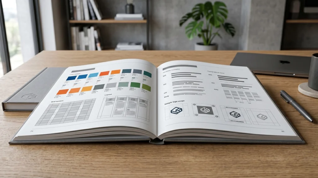
A high-end brand identity manual is not just a PDF with two color codes. It’s a normative ecosystem that defines the visual architecture of the business. Its fundamental pillars include:
1. The Logo System and its Clearance Areas
Determine how the logo interacts in different environments. Establish the permitted color versions (monochrome, dark backgrounds, light backgrounds) and, crucially, the isolation space: that safe zone that no other design element or text can invade, ensuring that the logo always “breathes” and maintains its impact.
2. Corporate Typography with Intent
The manual defines the primary and secondary typefaces, detailing the visual weights (bold, regular, light) and usage hierarchies for titles, subtitles, and body text. This ensures that the company’s written communication maintains a consistent visual tone of voice, whether in a legal contract or an Instagram story.
3. Color Palette and Technical Equivalencies
A critical mistake is defining a color in only one format. A professional color manual translates institutional colors into all the necessary technical languages: Pantone for special prints, CMYK for traditional printing, and RGB and HEX for screens and digital environments. This prevents the corporate blue from shifting to violet depending on the medium on which it is displayed.
4. Usos Prohibidos: Proteger el Activo de la Empresa
Just as important as stating what to do is defining what not to do. This section explicitly shows examples of distortions, prohibited background combinations, or alterations of proportions that degrade the brand’s value.
The Brand Manual as a Tool for Efficiency and Return on Investment
Beyond aesthetics, a brand manual is a financial and operational optimization tool for your company:
Dramatic time savings: Any new designer or vendor you hire won’t need endless briefings or have to guess which fonts to use. They’ll receive the manual and can start production immediately with pinpoint accuracy.
Reduced costs due to errors: Avoid having to reprint thousands of brochures or completely redesign website layouts because the color came out wrong or the logo became pixelated.
Increased perceived value: A brand that presents itself consistently across all touchpoints is immediately positioned in a higher market segment, allowing you to justify higher prices.
Conclusion
El diseño estratégico no decora; construye activos comerciales. El logotipo es la firma de tu empresa, pero el manual de marca es el contrato que garantiza que esa firma mantenga su valor legal y estético a lo largo del tiempo. Si estás listo para dejar de improvisar y transformar la identidad visual de tu negocio en un sistema sólido, consistente y escalable, es momento de diseñar las reglas del juego.