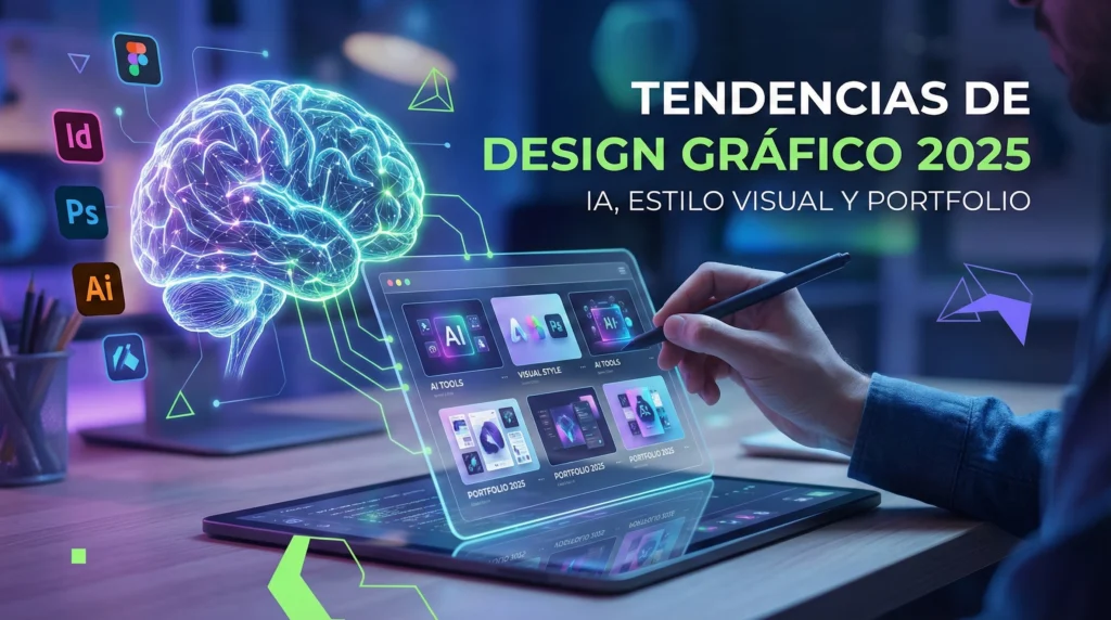
Introduction
There is a persistent belief that graphic design is a purely decorative discipline, a final step where one simply applies “pretty colors” or attractive shapes to a pre-existing idea. However, for the professional designer, aesthetics are merely the tip of the iceberg in a deeply analytical process. Designing is not decorating; it is solving communication problems. When I receive a proposal, my mind doesn’t immediately jump to a color palette or the latest trending typography; it dives into an analysis of objectives, audiences, and contexts. Effective design is that which survives the subjectivity of “I like it” to be grounded in “it works,” transforming a business need into a coherent and functional visual solution.
The Briefing: Hearing What Isn’t Said
Every great project is born from active listening. The first step doesn’t happen in Illustrator or Photoshop, but in a conversation or a strategy document. My initial goal is to break down the client’s proposal to understand the “why” behind the “what.” Often, a client asks for a logo when what they really need is a complete brand architecture, or requests a flyer when their audience lives purely in the digital environment. Without this diagnostic phase, the design risks being a simple, empty ornament that fails to meet business goals.
To dive deeper into this stage, I apply a viability and context analysis that goes beyond the surface level. It’s not just about noting down requirements, but questioning the client’s premises to find the true competitive advantage. I use artificial intelligence tools to organize key concepts and detect patterns in the competition that the human eye might miss on a first read. I am not looking for visual inspiration yet; I am looking for conceptual clarity. Without a solid briefing, any subsequent design, no matter how aesthetic, will lack purpose and fail in its primary mission: to communicate with intention.
The Architecture of Thought and Wireframing
Once the direction is set, I move on to structuring. In this phase, the design is pure skeleton. Whether it’s an interface or an editorial piece, I work in black and white, focusing exclusively on the hierarchy of information. What should the user read first? What is the call to action? This stage is crucial because it removes the distraction of color and texture, allowing functionality to take center stage. This is where it’s decided if the message is digestible or if the user will get lost in an unnecessary visual maze.
For a designer seeking efficiency, this is the phase that saves the most time in the long run. It is much more costly to change a structure when it is already rendered with effects and shadows than to do it in a schematic sketch. This “layout-first” approach allows me to validate the usability of the piece before committing to a visual style. It is an exercise in mental architecture where every white space has a reason for being and every alignment responds to a natural reading logic. By mastering wireframing, I guarantee that the foundation of the design is rock solid, allowing subsequent creativity to flow without structural obstacles.
Visual Alchemy: Typography and Color with Intention
This is where technique and psychology meet. The choice of a font is not a whim; it is the voice of the project. A serif typography can convey authority and heritage, while a geometric sans-serif evokes modernity and technical efficiency. Using Apple hardware and high-fidelity displays, my focus is on typographic precision, carefully managing kerning and leading to ensure flawless legibility on any device. I understand that typography isn’t just read, it’s felt, and that feeling must align with the brand’s values.
Color, on the other hand, is the emotional conductor that guides the user’s response. I don’t choose colors because they “match,” but because of how the brain reacts to them under applied color psychology. I use palettes that comply with strict accessibility standards, ensuring the message reaches everyone, including visually impaired individuals. At this point, AI helps me validate contrasts and suggest combinations based on contemporary color theory, allowing me to iterate much faster. This blend of human intuition and technological validation enables me to create visual systems that are not only beautiful but inclusive and psychologically effective.
Production and the Refinement of Detail
With the structure and aesthetics defined, we enter the technical execution phase within the Adobe ecosystem. This is where mastery of the tools makes the difference between an amateur and a professional. It’s not just about moving nodes, but about building smart files: using character styles, smart objects, and shared libraries that make the design scalable and easy to maintain. An optimized workflow allows me to make global changes in seconds, maintaining technical consistency that is vital to the integrity of the project.
Productivity at this stage is essential to meet deadlines without sacrificing quality. I automate repetitive tasks using Photoshop scripts or actions to dedicate my mental energy to the details that truly matter: the texture of an image, the subtlety of a gradient, or the mathematical alignment of elements using baseline grids. Professional design is recognized in the details the user doesn’t consciously notice but perceives as a fluid, high-quality experience. It is the difference between a piece that simply gets the job done and one that breathes professionalism from every pixel.
Delivery and Measuring Success
The process doesn’t end when I send the final file. A successful design is one that adapts to its real environment with the same efficiency with which it was conceived in the studio. Whether it’s optimizing files for the web with the least possible loss of quality or preparing final artwork for print with exact color profiles and precise bleeds, technical closure is the guarantee of my work. I make sure the client receives not just a design, but an asset ready to be deployed without technical errors that could compromise their company’s image.
Finally, I reflect on the results by analyzing the real impact of the piece. Did the design meet the objectives of the briefing? Did it facilitate conversion or improve brand recognition? Client feedback and the market performance of the piece are the true judges of the process. Graphic design is a continuous cycle of learning; every completed project is a database of knowledge that I apply to the next, refining my methodology to be increasingly faster, more strategic, and, above all, more effective in delivering real value.