Victory Flour
Branding, Packaging & Web Development
Victory Flour: Conscious & Allergen-Free Nutrition
Victory Flour is an allergen-free flour and baking mix brand founded by Victoria and Aurora. The core objective of this comprehensive project was to build a visual ecosystem that communicates their commitment to ingredient transparency and digestive health, anchored in a simple philosophy: enjoy food without fear.
- Client / Brand: Victory Flour (Founders: Victoria & Aurora).
- Industry: Healthy Foods / Allergen-Free Baking.
- Scope of Work:
– Design de Identidade Visual e Manual de Marca (Isologotipo, diretrizes de uso, sistema tipográfico).
– Design e Diagramação de Embalagens (Stand-up Pouch de 24 oz / 680g para Pancake & Waffle Mix e All-Purpose Flour).
– UI/UX Design (Promotional landing page). - Brand Colors: Victory Teal (
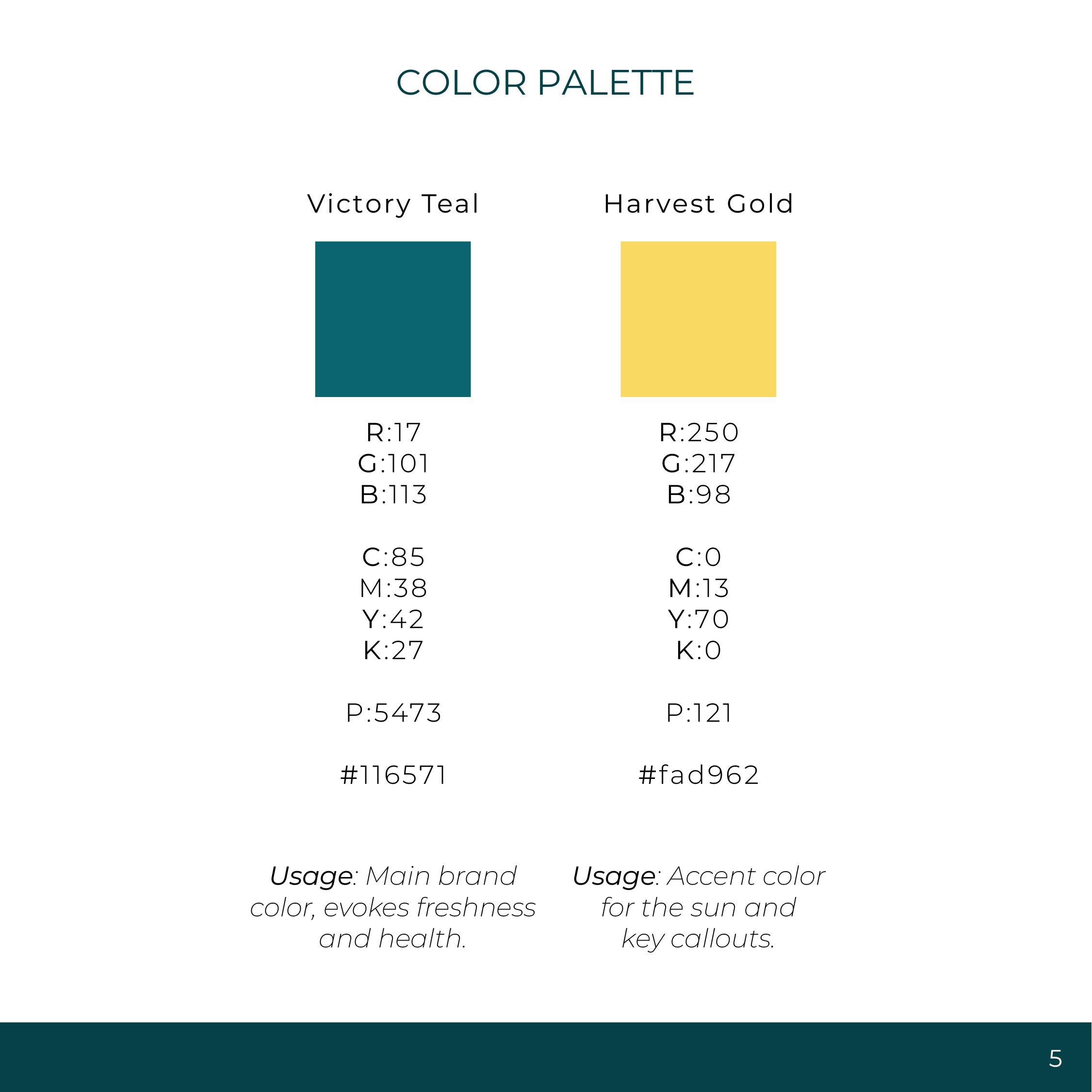
#116571) and Harvest Gold (#fad962). - Primary Typography: Montserrat.
Visual Identity & Brand Guidelines
Visual Ecosystem & Brand Style Guide
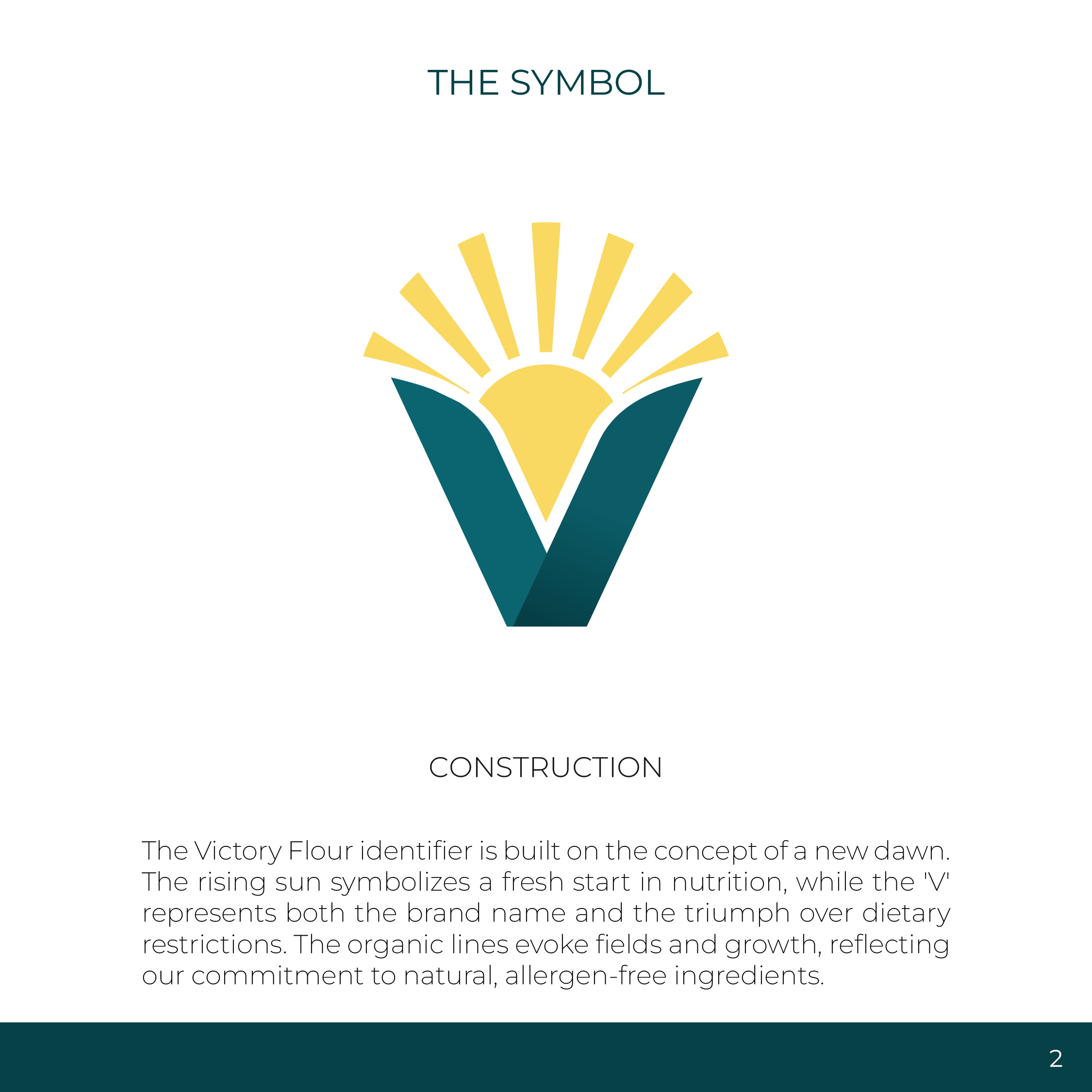
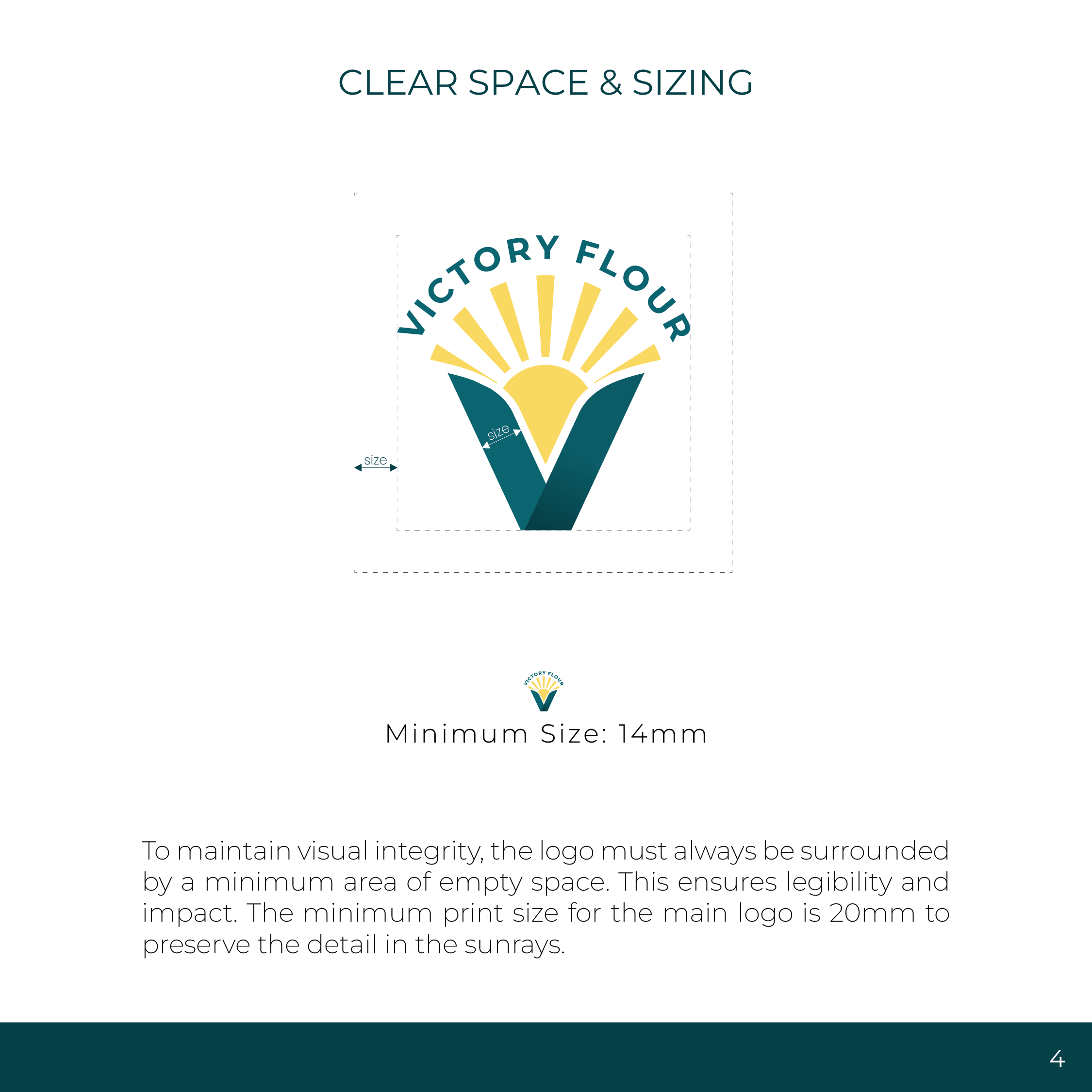
Development of the core logo and comprehensive brand guidelines. The central mark combines a rising sun with the letter “V” to signify a fresh start in nutrition. The system relies on the Montserrat type family paired with a balanced color palette featuring Victory Teal (
#116571) and Harvest Gold (#fad962).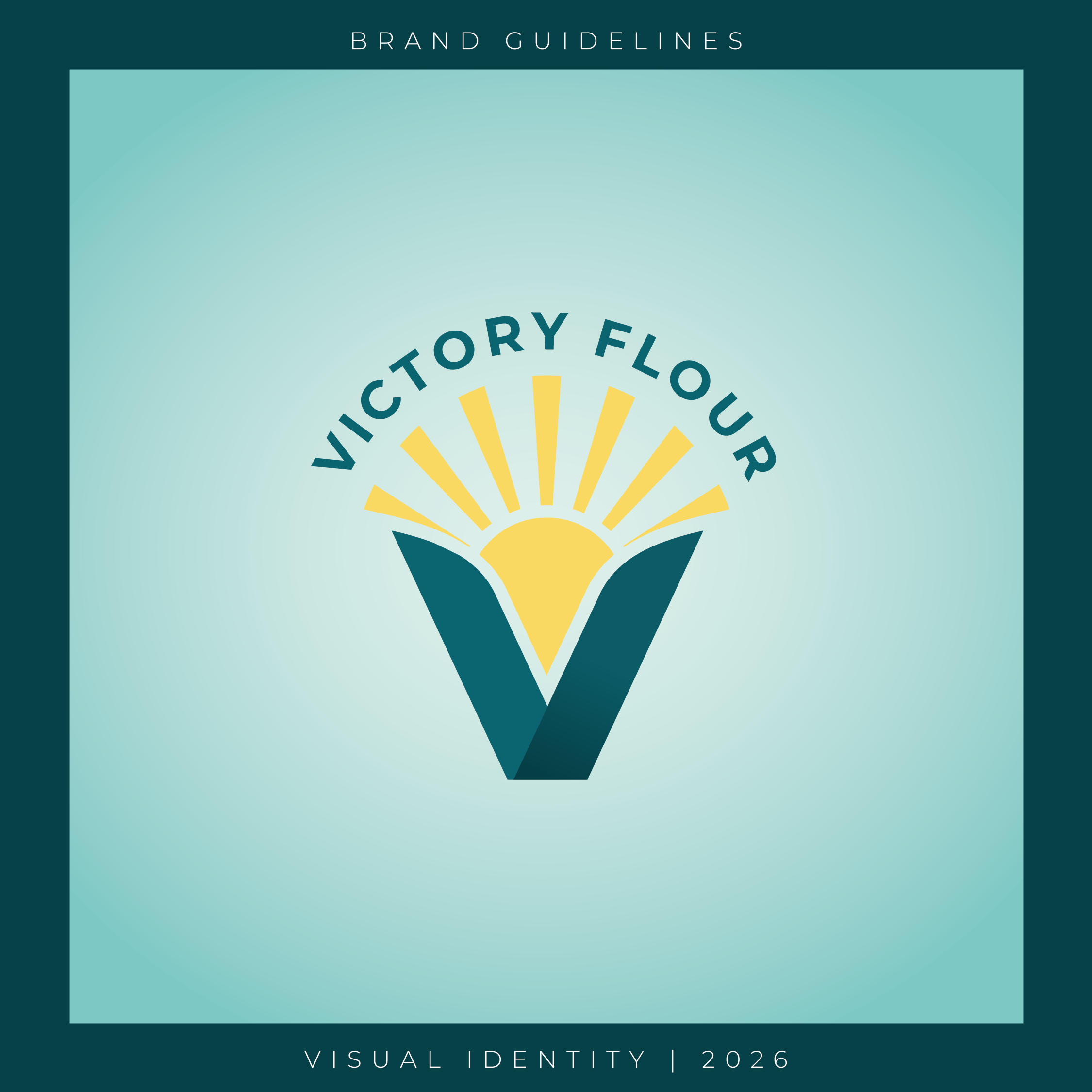
Packaging Design & Retail
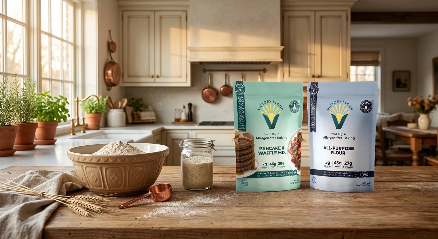
Stand-Up Pouch Packaging System
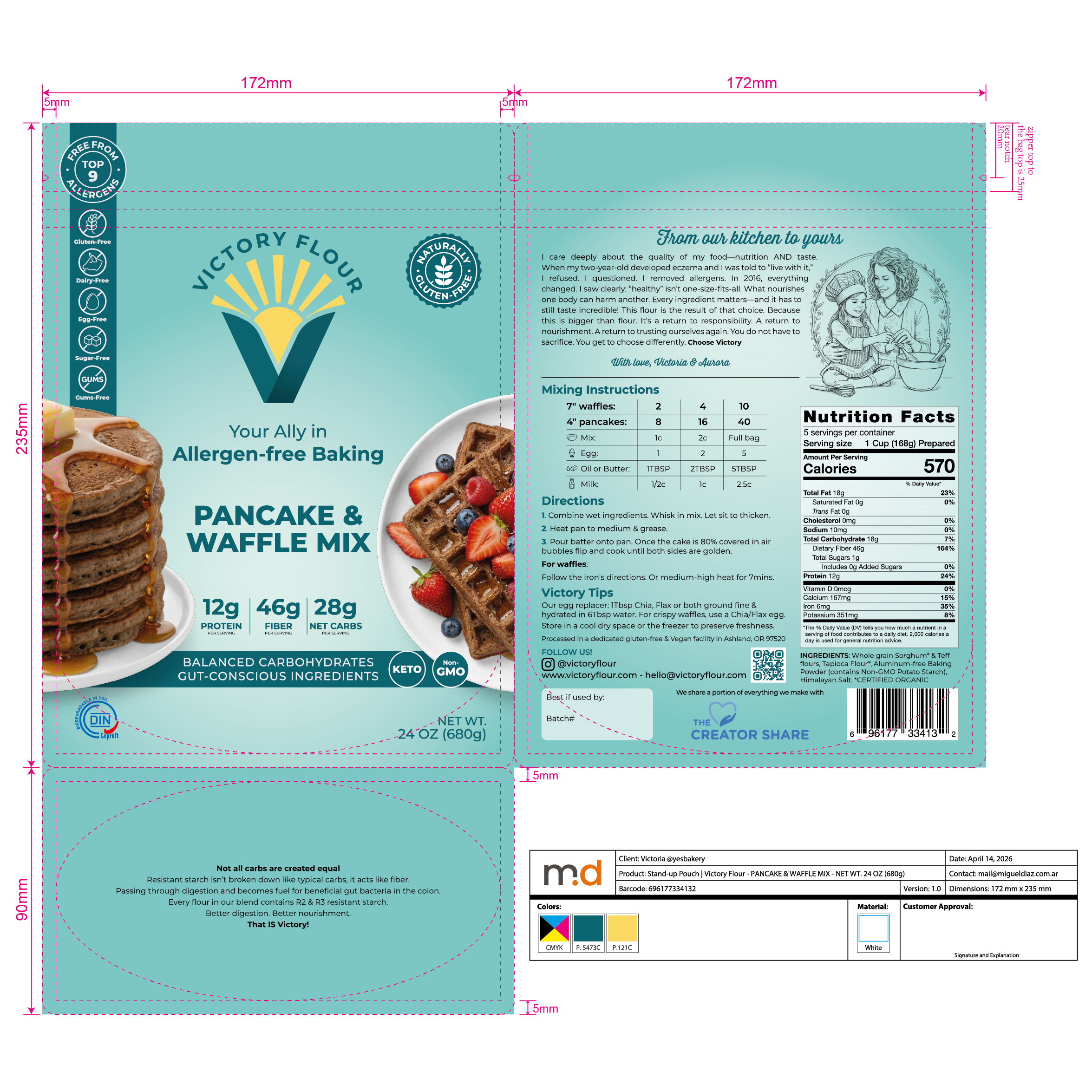
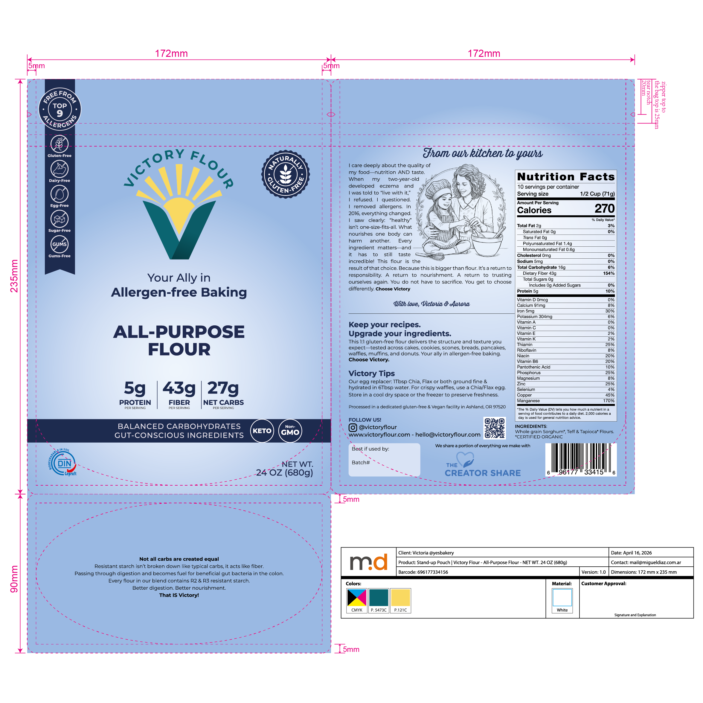
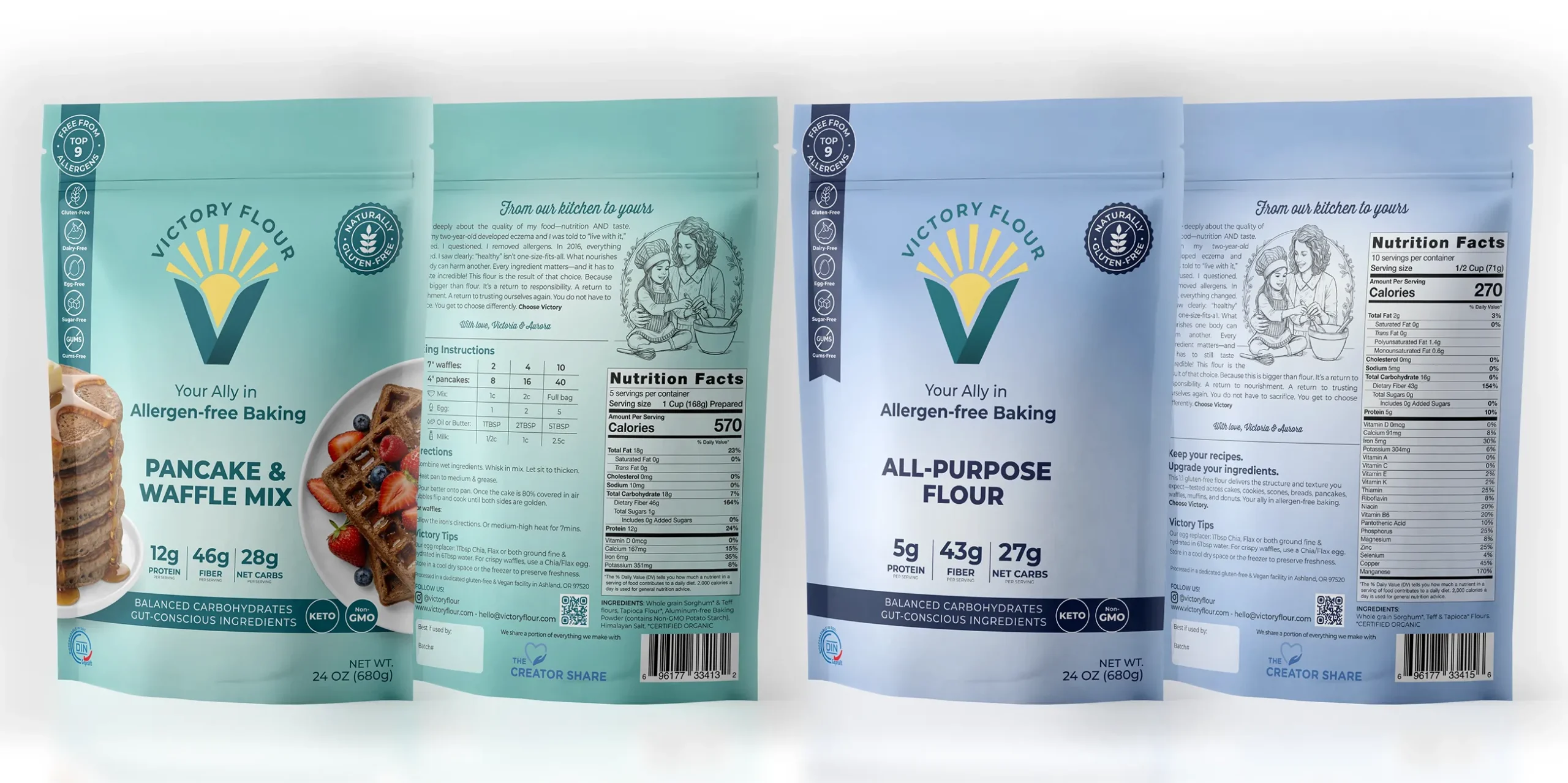
Packaging design and print-ready layout for the Pancake & Waffle Mix and All-Purpose Flour lines in 24 oz (680g) stand-up pouches. The front panel highlights key trust badges for quick retail scanning (Top 9 Allergen-Free, Gluten-Free, Non-GMO), while the back panel balances the brand story, step-by-step baking instructions, and the FDA nutrition facts panel. Delivered as press-ready CMYK files for manufacturing.
Web Development & Ui/Ux
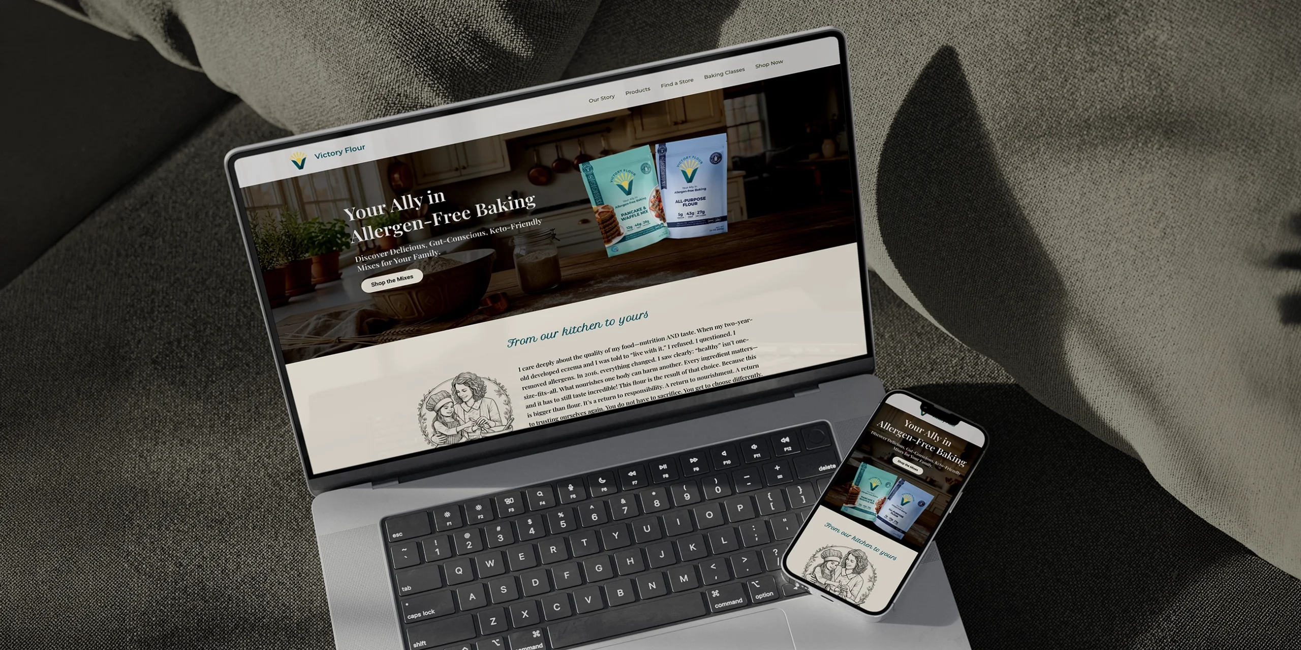
Promotional Launch Landing Page
Digital interface designed to support retail distribution and drive customer acquisition. Built strictly around the brand guidelines, pairing corporate colors with a clear typography hierarchy to ensure a fast, frictionless, mobile-first user experience.